Tuesday, October 30, 2012

Controller Vision


            When I look for a controller that I want for FPS, Role-Playing and Sports games, I try to find a well-rounded unit that is also comfortable to use. I also look for it to me light and compact, so what I propose is a standard generic controller that is compact and conventional for what ever game you choose to play with it. I would like to make a controller that would be able to be used with Smart Phones, tablets, computers, consoles and handhelds. The controller itself would also have the ability to have custom button layouts. I want to make a controller that can be used for any game with any device.

     
            I call it the Chameleon because it can adapt to any device with any button configuration. The controller would be roughly the size of the iPhone4. With it being this small, it may be too small for lager hands. This is where the player could buy and attach some additional pads to each side of the controller for a better fit. With the traditional button layout, the player should have no trouble picking it up and playing with it. And with it being so small the player could bring it with them where ever they go.
            Since the button layout is traditional, FPSs, RPGs, Sport games, Fighting games, any genre will be playable. With this controller having the ability to connect to mobile devices via blue tooth, the player would be able to switch from touch controls to the controller. With the Chameleon being able to connect to computers, it would also be compatible with emulators, playing classic NES, SNES, N64, PS One, PS2, Gameboy, etc.

Thank you for reading my post and I look forward to answering any questions or response.

Daniel Weimer

Thursday, October 25, 2012

Bad GUI: Madden NFL 12 (iPhone)


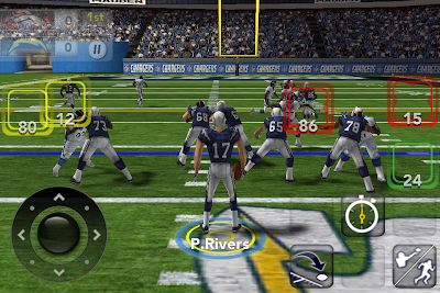
            I will be discussing the bad game interface designs for Madden NFL 12 for smart phones. Madden NFL 12 is a sports touch football smart phone game. The player can choose what teams they would like to play with in different modes. The player only needs one finger to play this game. There isn’t anything very innovative about Madden NFL 12, considering it looks like Madden ’98 with new players.

1. When first starting the app, there are four options plus some other buttons. There is a football players picture that usually s it difficult for the text to be read. Also in the bottom of the screen there are a few buttons that make the screen have a cluttered feeling, and there are logos to add to it. It can also be difficult to touch the right menu if you have bigger fingers.


2. Once the player chooses the Play Now, the screen displays two teams that you can chooses from, Settings, Back and Play buttons at the bottom. The buttons can be very difficult to push and sometimes the game won’t register when you want to change teams.


3. If a player wants to trade players, they will have to use this screen, which is actually terrible. Every part of the screen that you can select is way to close to each other. I understand that the screen is very small and it is hard to make an interface that is effective, but maybe the developers could have used larger buttons and pages. And again the buttons at the bottom are difficult to press.


4. While actually playing the game, it is very difficult to pass the ball. When the player starts a pass play, red, yellow and green boxes, which are very close together, represent the available players that can catch a pass. This makes it very difficult to pick the right player that you want when throwing the ball.


Thank for your reading my post and I look forward to answering any questions or responses.

Daniel Weimer

Good GUI: Diablo III

-->
            I will be discussing the good game interface designs for Diablo III. Diablo III is a Blizzard Entertainment hack and slash role-playing computer game, where the player can choose from five different classes, Barbarian, Witch Doctor, Wizard, Monk and Demon Hunter. The player plays alone or with a group (2-4 players) and fights against hordes of demons to save the world of Sanctuary. The game consists of four acts, with four unique boss battles. The player has the ability to equip their own armor and choose their own skills and they try to beat all four bosses and reach character level 60 and paragon level 100.

1. When first starting up the game, the Diablo III login screen is very simple and also very cool looking with the background and blood red buttons. The ID and Password bars are in the center with options and or menus in the bottom left of the screen. On the right side of the screen, there is a “Update” box, where Blizzard post Diablo related news. It is very simple to navigate and with the dark background, the screen is very soft on the eyes.


2. Upon logging in, the player is greeted by their character in the center of the screen and a number of buttons on the left side of the screen. The “main” character has its character and paragon levels displayed below, with the “Switch Hero” button. Also next to the character, their banner is displayed. The buttons that are displayed on the left are the “Resume Game,” “Change Quest,” “Public Games” and “Auction House” buttons. Under these buttons there is the chat box with a few chat settings and scroll buttons. In the bottom right corner there are the “Profile,” “Achievement” and “Settings” buttons, with a “Friends List.” When hovering over the buttons, a tool tip appears.


3. When in the “Change Quest” area, the player can choose which act, difficulty and quest they want to play. For players who have the “Monster Power” enabled, they can also choose which Monster Power Level (0-10) they would like to play against. The menu is very easy to maneuver.


4. When in the game, the UI is very easy to read and learn how to use. The main components of the game, skills, health, mana/fury/arcane power/hatred & discipline/spirit and shortcut buttons, are located at the bottom of the screen. If the play doesn’t know what a button or skill does, they just nee to hover the mouse cursor over the item in question and a tooltip pops up and tells the player about the item. This makes it very easy to learn how to play the game on the fly without having tutorials or training areas.


5. The Skill screen in extremely easy to use. When a player opens the screen, a smaller screen pops up that allows them to select skills that are available. The player can also choose which hotkeys the skills are assigned to. Once the player clicks a skill slot, the player can choose from any spell if they have activated “Elective Mode.” Each skill has a description when clicked to help the player figure, which they would like to use.


Thank you for reading my post and I look forward to answering any response or questions.

Daniel Weimer