I will be discussing the bad game
interface designs for Madden NFL 12
for smart phones. Madden NFL 12 is a
sports touch football smart phone game. The player can choose what teams they
would like to play with in different modes. The player only needs one finger to
play this game. There isn’t anything very innovative about Madden NFL 12, considering it looks like Madden ’98 with new players.
1. When first
starting the app, there are four options plus some other buttons. There is a
football players picture that usually s it difficult for the text to be read.
Also in the bottom of the screen there are a few buttons that make the screen
have a cluttered feeling, and there are logos to add to it. It can also be
difficult to touch the right menu if you have bigger fingers.
2. Once the
player chooses the Play Now, the screen displays two teams that you can chooses
from, Settings, Back and Play buttons at the bottom. The buttons can be very
difficult to push and sometimes the game won’t register when you want to change
teams.
3. If a player
wants to trade players, they will have to use this screen, which is actually
terrible. Every part of the screen that you can select is way to close to each
other. I understand that the screen is very small and it is hard to make an
interface that is effective, but maybe the developers could have used larger
buttons and pages. And again the buttons at the bottom are difficult to press.
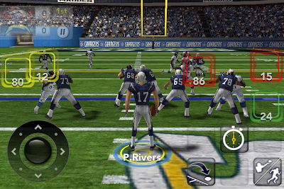
4. While
actually playing the game, it is very difficult to pass the ball. When the player
starts a pass play, red, yellow and green boxes, which are very close together,
represent the available players that can catch a pass. This makes it very
difficult to pick the right player that you want when throwing the ball.
Thank for your
reading my post and I look forward to answering any questions or responses.
Daniel Weimer


No comments:
Post a Comment